Jabiru
The Brief
Reinvigorate a tired NFP brand and evolve its kid-friendly identity to resonate with corporate and government audiences, while retaining the warmth and playfulness that connects with children and families.
The Insight
The existing brand had strong recognition but felt dated and overly child-focused, limiting its credibility with professional stakeholders. The opportunity was to modernise the visual language while preserving the character and warmth that make the brand approachable.
The Result
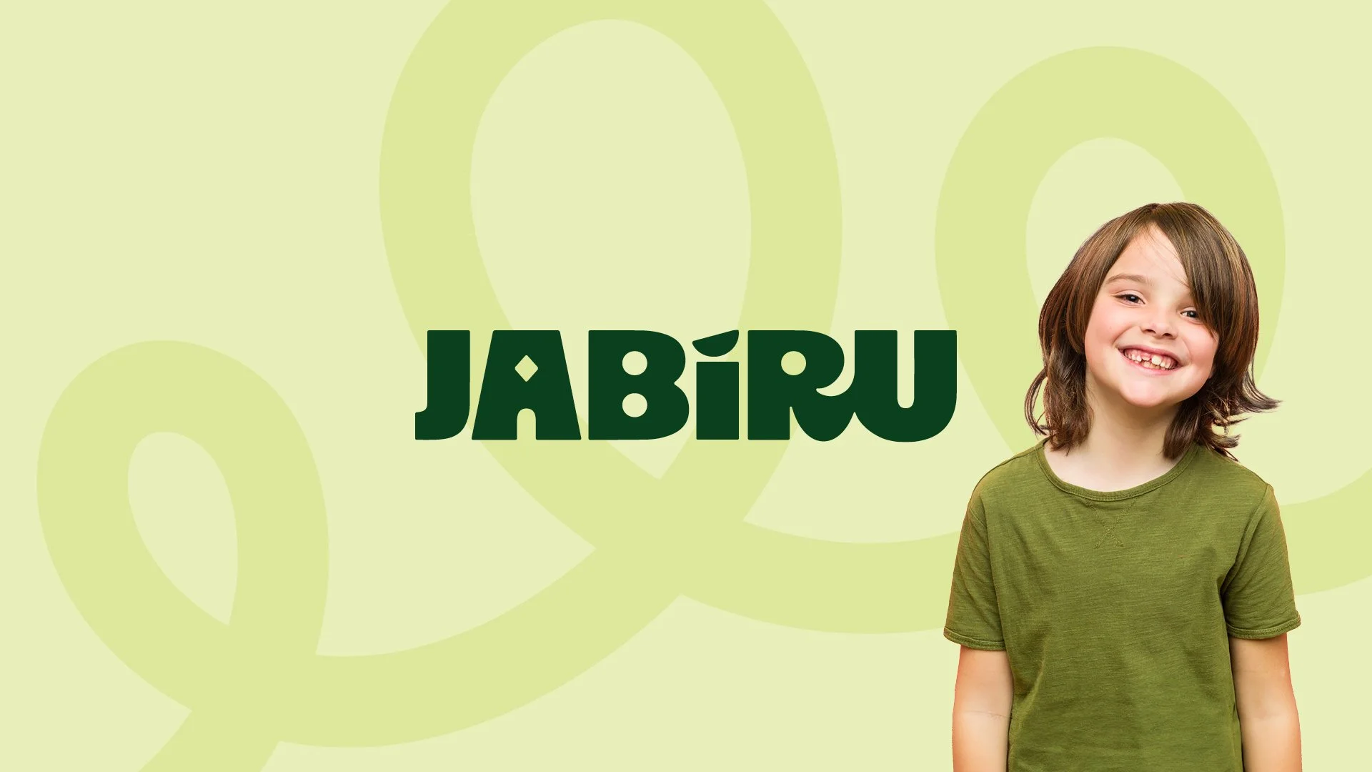
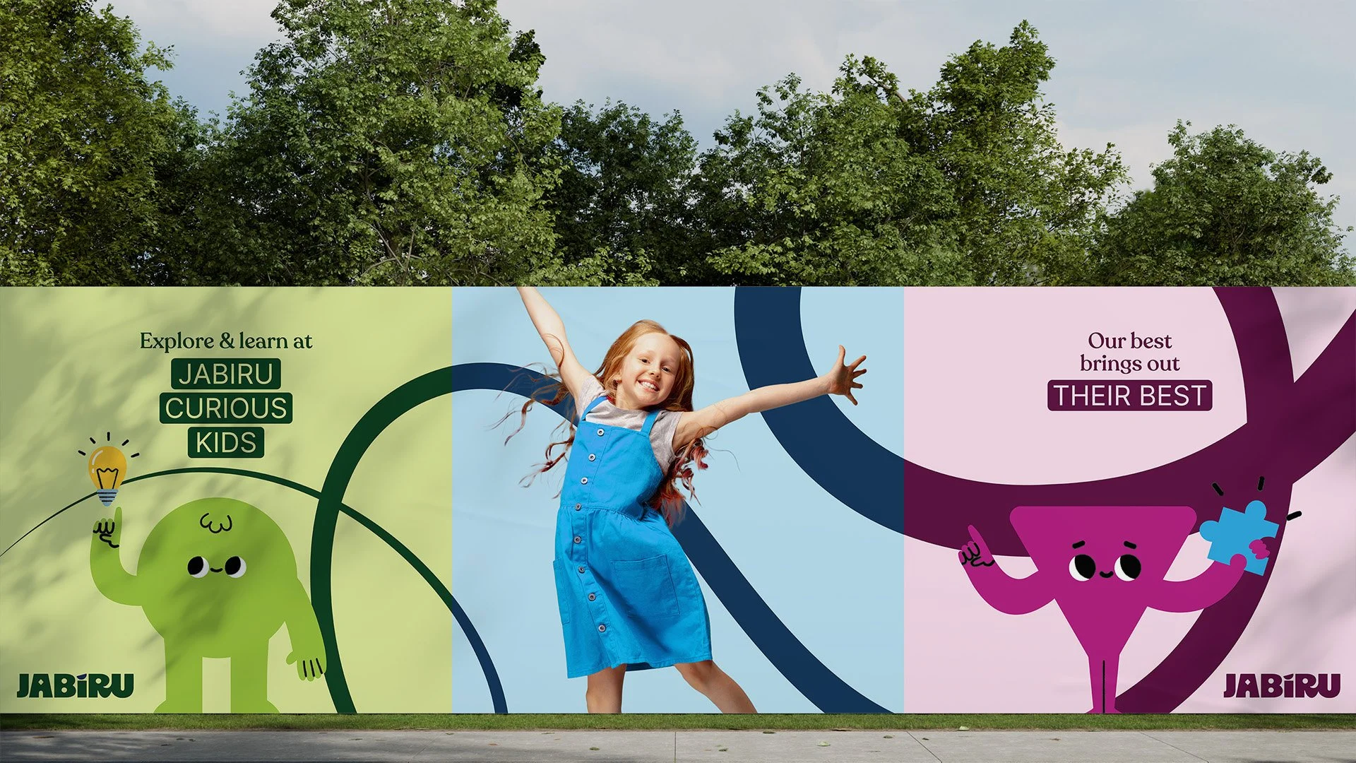
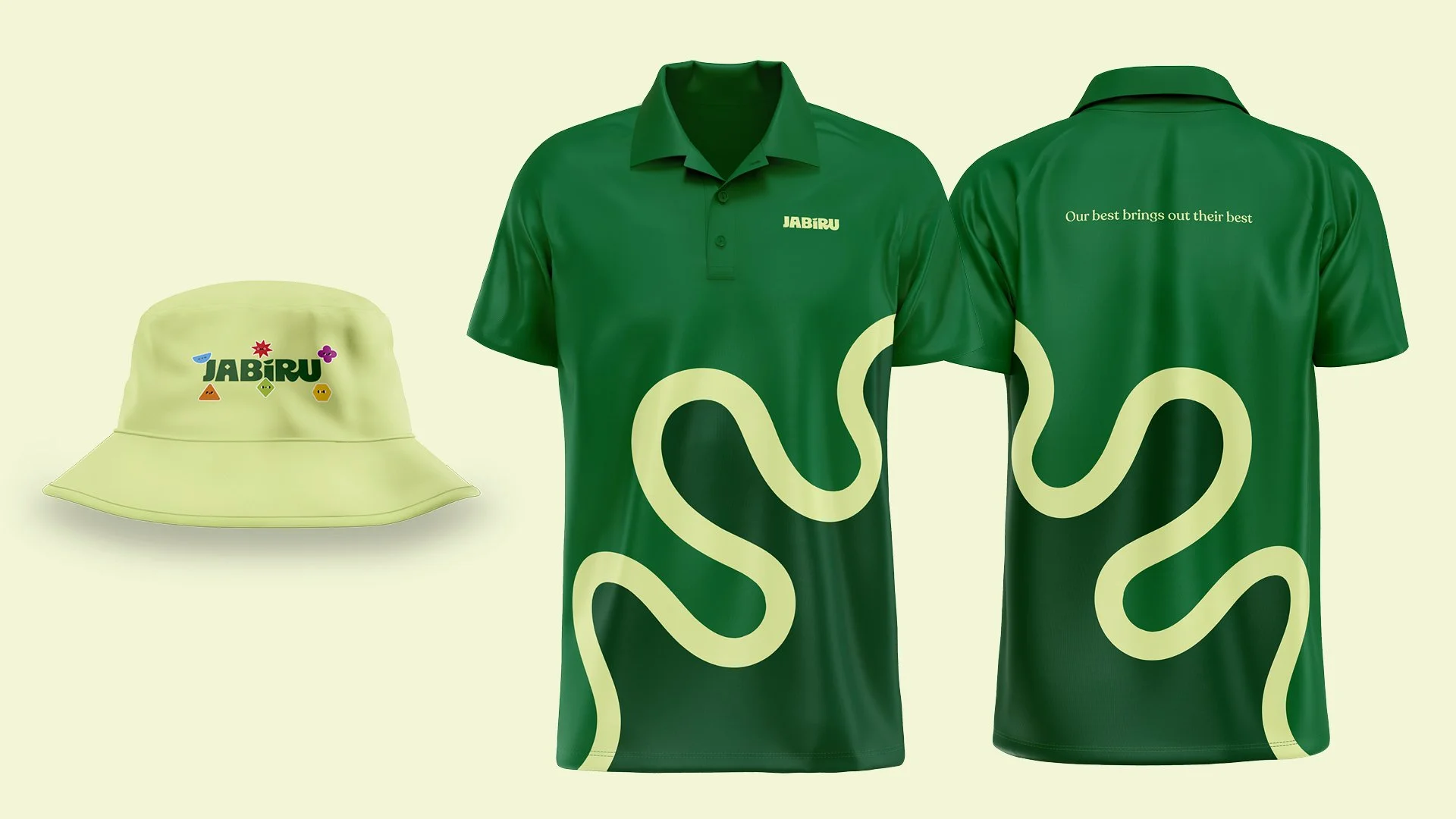
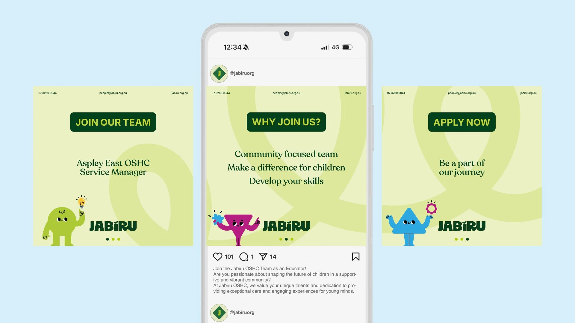
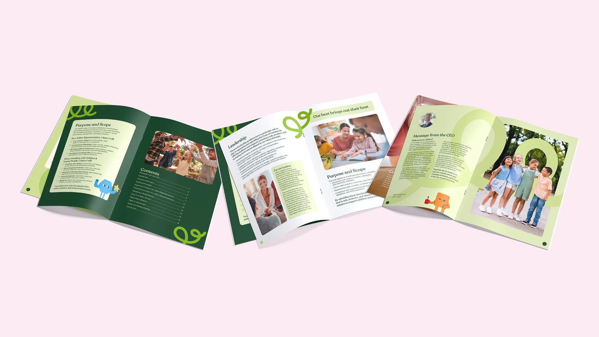
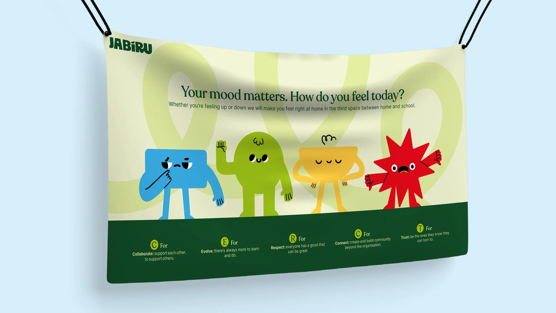
A bold, modern identity built around a refined colour palette and contemporary typography, supported by illustrated characters. Together these elements form a flexible, scalable design system that modernises existing assets while maintaining a fun and friendly tone.
The system is designed to work across a wide range of applications from classroom wall murals and community event flyers to digital platforms, allowing for consistent storytelling across mediums. Brand colours were carefully selected with accessibility in mind, ensuring strong contrast and readability across both digital and physical environments.
The result is a brand that feels playful and child-focused while also polished and future-ready, positioning Jabiru as a leader in OSHC education with a clear vision for what’s next.