Hype Mogul
Brief
Reposition Hype Mogul, a PR and talent agency, with a bold, distinctive identity that captures its role as a champion of powerful narratives and diverse voices.
Insight
The brand thrives on illuminating stories and amplifying risk-takers. Its visual system needed to embody this ethos: not just a logo, but a design language that feels dynamic, stage-ready, and expressive of narrative power, with a visual spotlight that highlights individuality and momentum.
Result
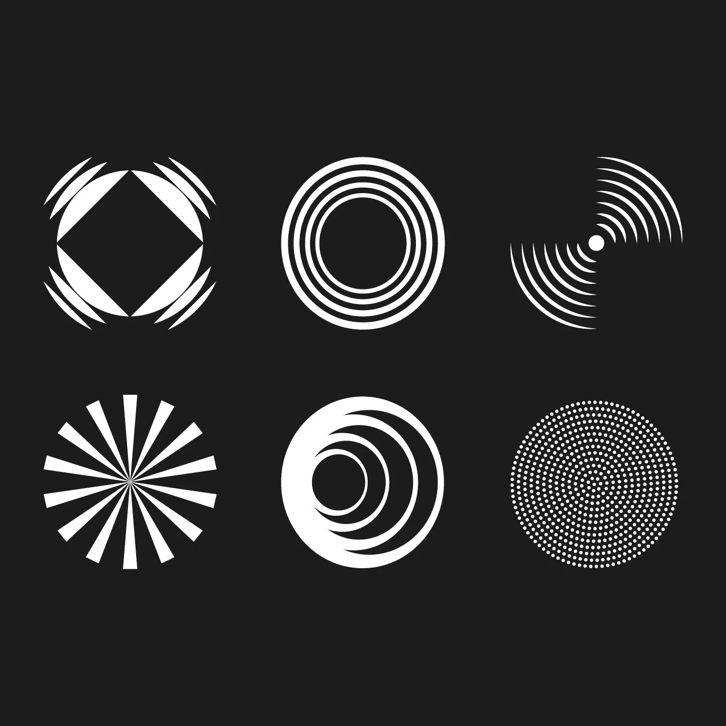
Delivered a strategic visual identity and design system rooted in a circular spotlight motif that becomes the central organising graphic, evoking both illumination and focus. The system balances boldness with depth through:
The design system combines a flexible spotlight motif, dynamic typography, and layered visual textures to create hierarchy, movement, and storytelling across all layouts. A dark core palette grounds the brand in depth, while vibrant gradients highlight diversity and energy. This cohesive system translates seamlessly across print, digital, and environmental collateral, ensuring every touchpoint is expressive, coherent, and visually impactful.
The result is a distinctive, adaptable brand language that elevates Hype Mogul’s positioning, making the agency unmistakable in a crowded marketplace and visually aligned with its narrative-driven mission.